
In the current diversification of lifestyles, in those spaces that have received many praises, you can often see style symbols that can talk and communicate with each other. They are gathered by a certain force, maintaining their inherent characteristics, and working together to complete The shaping of one space after another, this kind of space that makes people feel undefinable, is often called a "mix and match" style.
In addition to symbols, style is a carrier of spirit. This spirit is embodied in the three dimensions of color, material, and shape (pattern). The three dimensions of each style can be disassembled and recombined to form a new style. This kind of "deconstruction" and "reorganization" is precisely the core spirit of "postmodernism". The importance of color is very significant.

Color tips
Edward Hopper's most famous work is "Nighthawks" in 1942. The cold and lonely atmosphere in this painting has become his iconic style known to the world. The painter always uses concise, general, and color-blocked cool colors to express the relationship between the town and people. From his works, people can immediately feel a certain sense of loneliness and alienation hidden in the city. The work collection "Hopper" published by the publishing house Taschen, in addition to the artist's painting images, the text part also introduces the artist's creative themes in more detail.

Key colors: bright yellow, royal blue, coral red
Color ratio: white/light wood color: high saturation color (bright yellow, royal blue, coral red ): black = 7∶2∶1
Color matching: In 1977, when the Centre Pompidou appeared in a Paris neighborhood, people were naturally confused about this weird building with colorful pipes. Today, this representative building of postmodernism has become a model for people to "deconstruct" classics and "reorganize" their lives. Bright colors, different conventional design shapes, mixed modeling symbols, innovative material applications... are all the labels of postmodern furniture.

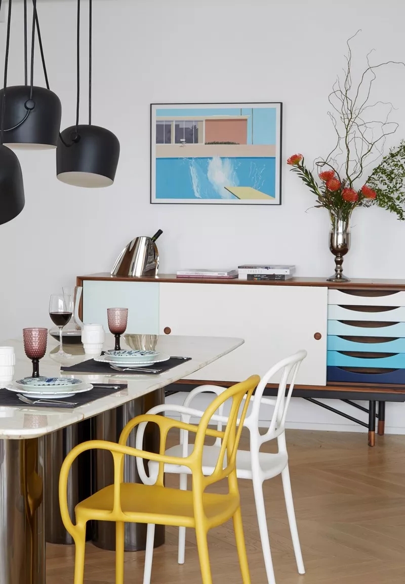
Use neutral colors such as white and light wood as the background color, and use furniture with similar chromaticity (the vividness of the color) as the embellishment to form the main color relationship of the space, and use decorative elements such as hanging paintings to help strengthen the main theme of this color (such as In the living room of this case, the bright yellow and royal blue in the furniture and lamps and David Hockney's "A bigger Splash" on the wall form a hue echo and a contrast in color intensity. The flesh pink in the painting is reflected by the coral red sofa chair. Shuangbao Design Agency

Color tips
British artist David Hockney is a crossover artist who is still active in the art world. The fields involved range from painting and photography to interior design, stage design...and so on. This old man born in 1937 can be said to be one of the most influential British artists in the 20th century. Today, with the development of the self-media, this representative of postmodern art has also been introduced to the Chinese public for his famous swimming pool series. As he showed in his masterpiece "Big Splashes", Hockney's works are always flat and concise, with bright and relaxed colors and full sense of light. This style can still be seen in his interior design and home design. Hackney's Picture, a collection of Hockney's works published by the publishing house Thames & Hudson Ltd, allows you to see the artist's childlike curiosity.

Key colors: malachite green, red, black and white
Color ratio: white: black: malachite green: bright red = 6∶1∶1∶2
Color matching: The combination of big red and big green has always been prohibitive and uneasy, but there are always countless ways to control it. As in the case of this issue, physically separate the two (not appearing in the same space), choose one of the single colors as a strong color to lay the color theme of the space, and the other is an important embellishment color.

The study space of malachite green is presented on a carrier with a large area such as walls and wall cabinets. At the same time, the paintings, photos, and decorations are all green in different degrees and tones, and the brightness contrast between each part is emphasized. The relationship makes a deep impression on this part of the space. The bright red in the living room uses only a small area, but it stands out from the crowd of black and white background colors, which also leaves a deep impression on people. In this way, a strong and colorful impression of the space is formed, but in fact, there is no excessive force or excessive use of color. Shangshe One House

Color tips
Andy Warhol can be described as a phenomenal figure of postmodernism in the 20th century and a spokesperson for Pop Art. Even today, you can still see his famous cans and cans printed on Uniqlo’s T-shirts. banana. Screen printing has produced incredible and unexpected color magic in his creation, and the artist's own legendary experience can also be said to be a commentary of this era. "Phaiton Focus Artist: Andy Warhol" published by Guangxi Fine Arts Publishing House is a good choice as an introductory book for understanding contemporary art. (Sold on Jingdong and Dangdang)
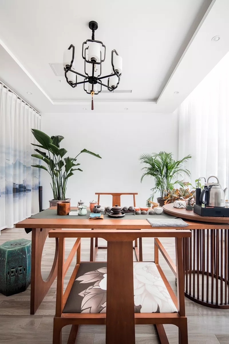
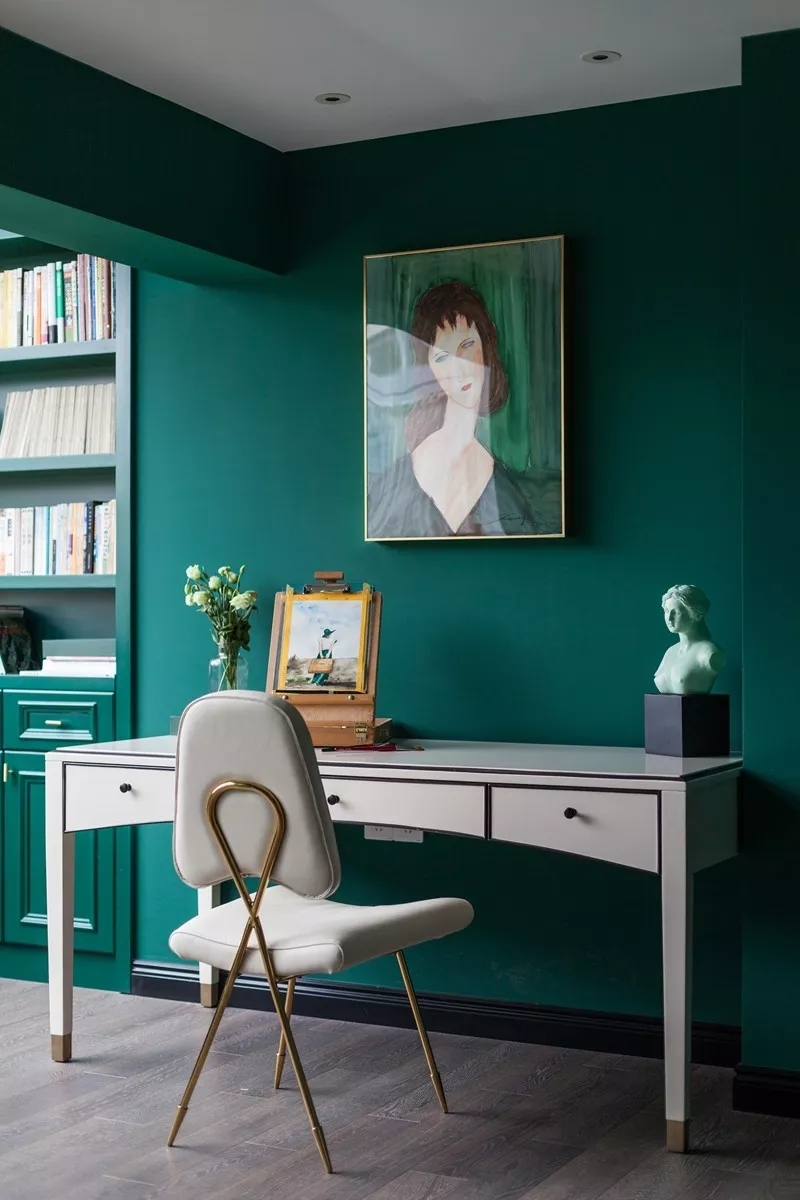
Key colors: malachite green, lake blue
Color ratio: neutral color (white, wood color, gray): lake blue: malachite green = 7∶2∶1
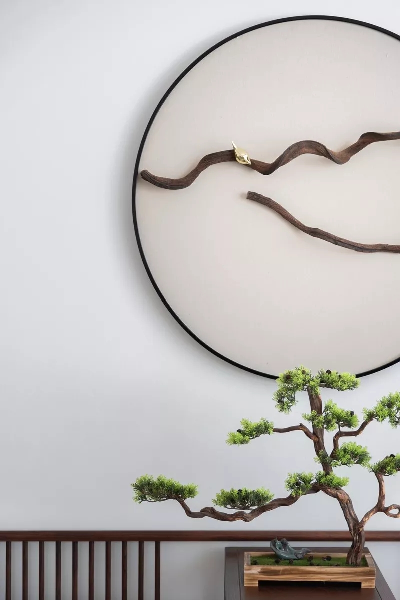
Color matching: Among the many "new Chinese" styles with different temperaments, the light luxury Chinese style is the more fashionable one. The light luxury style itself has many elements of Art Deco style. For example, golden furniture components, exquisite geometry, velvet texture that often appears, and iconic colors such as malachite green. Although a cool color like malachite green is more vivid, it can still show a sense of "coldness" and "deepness" when combined with blue.

Coupled with images with a strong oriental charm, such as landscapes, flowers and birds, potted plants, etc., the "youyuan" and "Zen" in the Chinese style will appear. Although malachite green and lake blue are not as intense as warm hues, they are bright colors after all, so they can appear in smaller areas of embellishment colors. The Chinese style emphasizing "inaction" and "emptiness" and the light luxury style of admiring "small and gorgeous" are organized in the same space. Doesn't this mashup method reflect the spirit of postmodernism? Two completely different forms of expression are connected through the key two colors to form a distinctive space atmosphere. This method is also a tried and tested trick in other styles of mixing and matching. Hong Kong Gaudi Design Office

Delicate tiles deliver a customized look that deserves to be featured. These glass tiles stun in an accented picture frame configuration or, for a bolder take, on a full bathroom floor or floor-to-ceiling accent wall. Consider using a contrasting grout color to really enhance the unique shape.
Made from recycled glass,this innovative product has excellent inherent characteristics.They are strong and wear resistant.They are perfect for interior and exterior projects, such as floor,bathroom wall,shower wall and kitchen backsplash.We have different kinds of exterior and interior Glass Mosaic Tiles, also different colors are available for different shapes. Such as Square,Brick Shape,Basketweave,Beveled,Waterfall,Hexagon, Octagons,Herringbone,Leaf,Pentagon,Long Brick,Chevron,etc.
Blue Mosaic Tile,Cheap Mosaic Tiles,Custom Mosaic Tile,Trapezoidal Glass Mosaic Tile
C&K MOSAIC , https://www.cnkmosaictile.com